BRANDING for a REAL-ESTATE FIRM

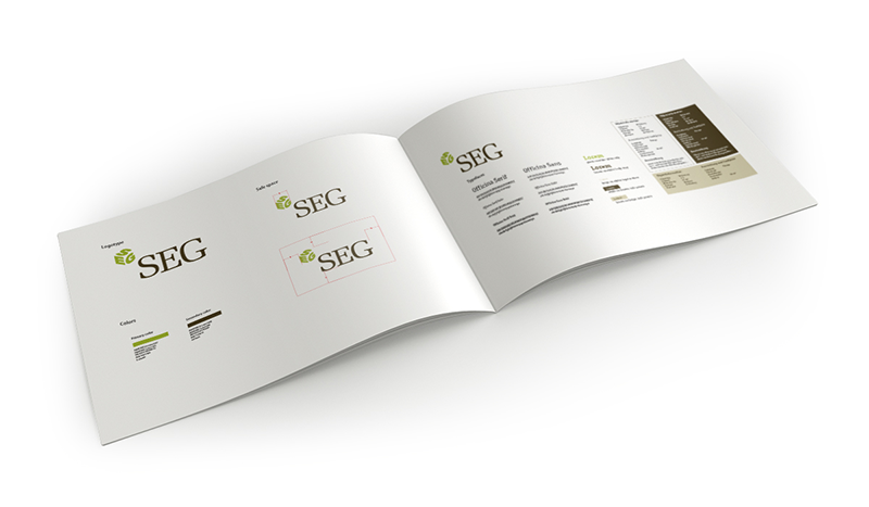
A typical illustration of "a logo is not a brand": This company had a logo, a set of fonts colours and a color palette and still their branding was inconsistent and out of control. My first task was to give them. A clear and concise style guide with indications about position, find usage for specific purposes and clear rules. I redesigned some of their promotional material and they were then able to implement their branding in a more sleek manner.

title

title

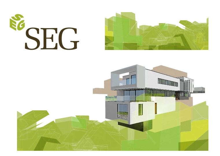
Another issue that this company faced was a lack of an eye-catching look (trade shows are visually very busy) and architectural renders that are sometimes cropped arbitrarily. I designed an abstract geometric element that could be used as an overlay, a running pattern, and a visually strong tool to unify their material

title

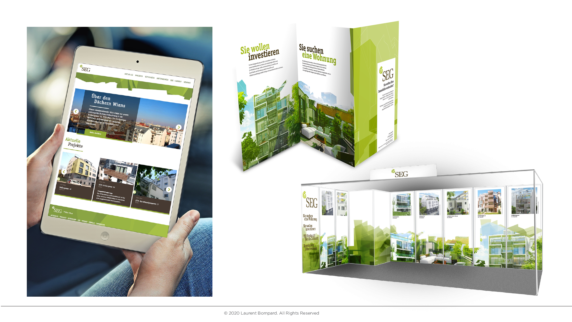
The geometric element shown here in context on their website, brochures and booth design.